Creative Direction | Graphic Design | Brand Identity | Art Direction
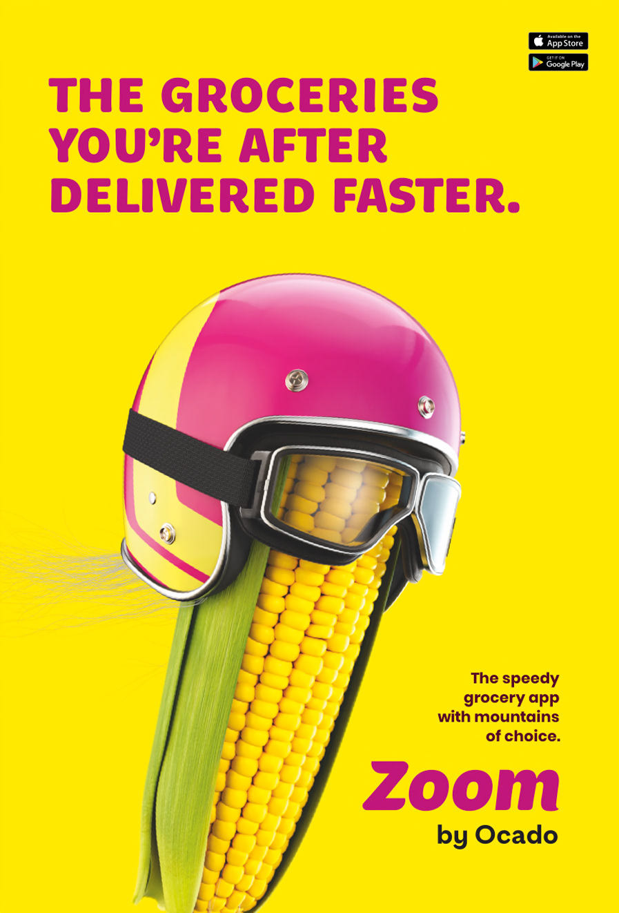
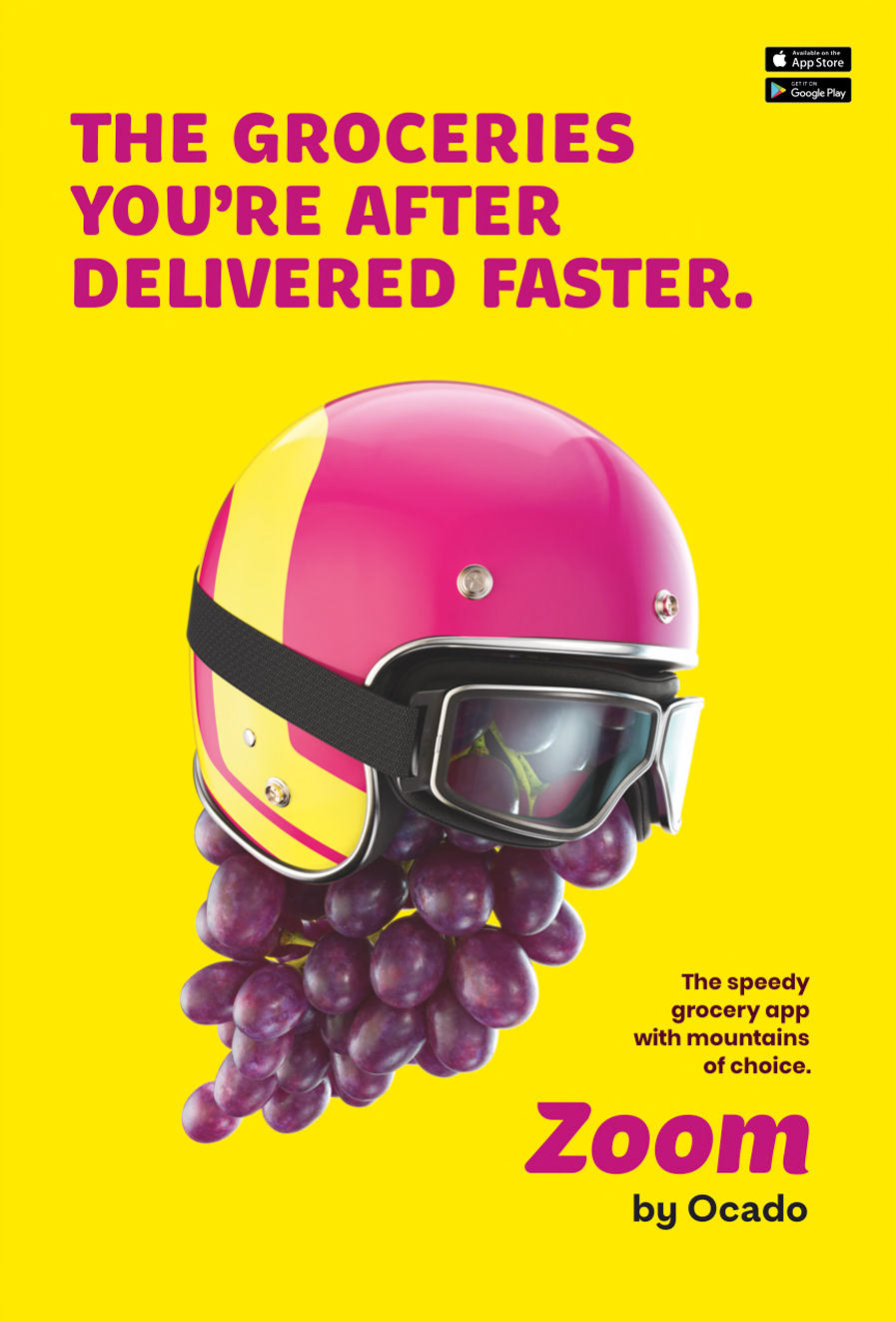
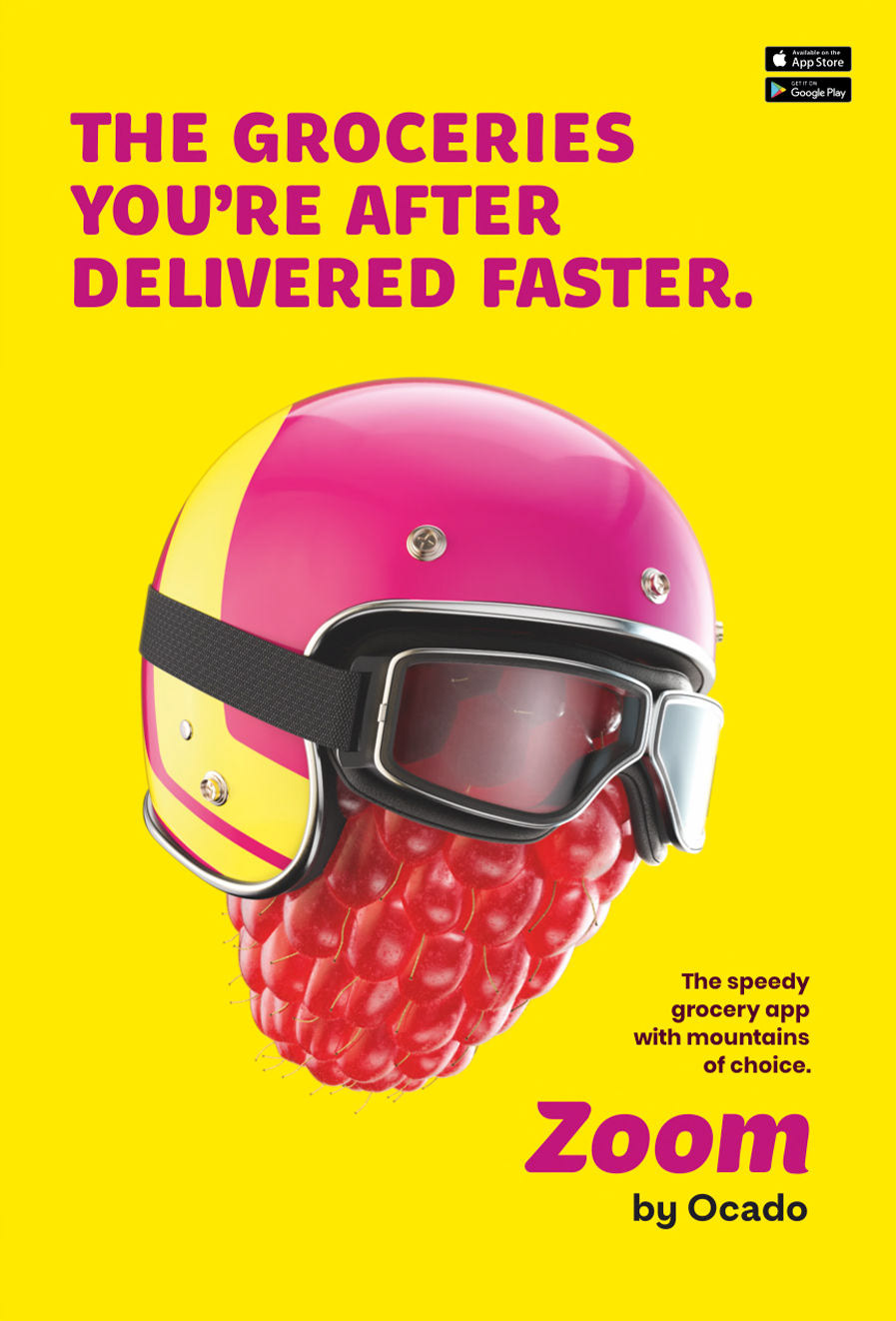
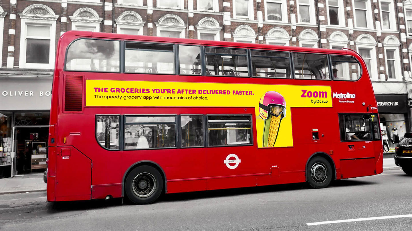
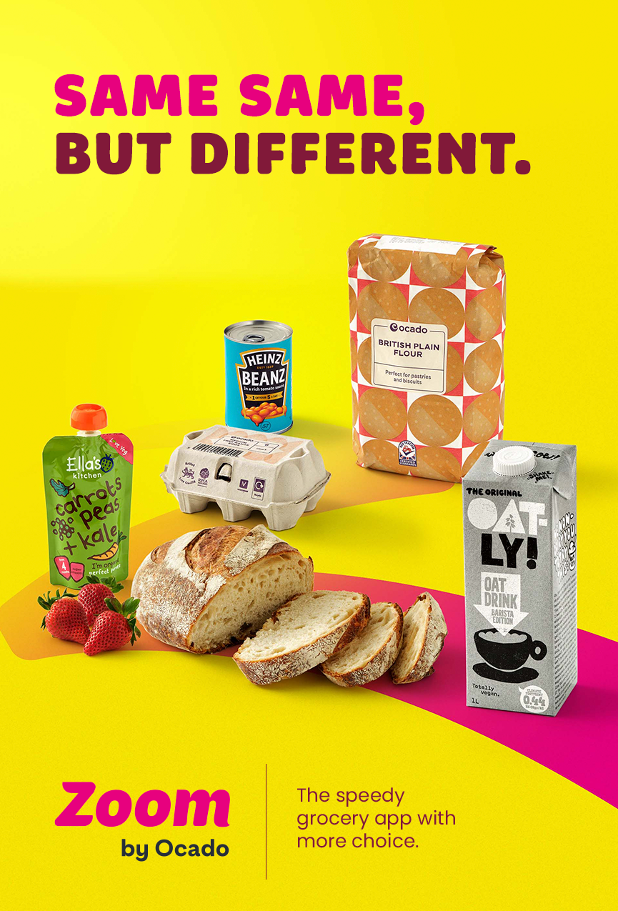
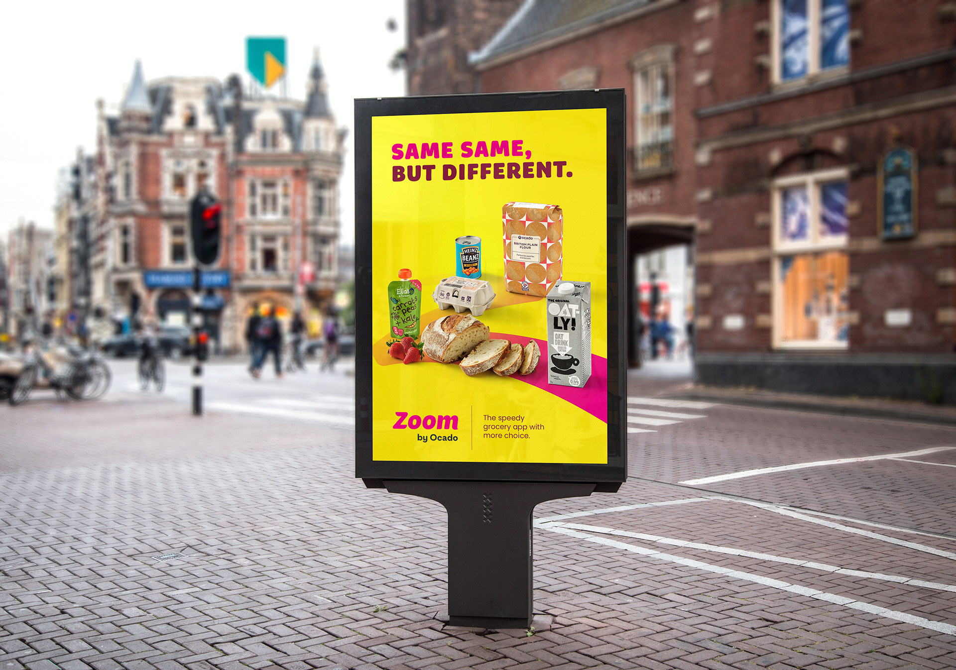
‘Zoom by Ocado’ is a delivery service that promises ‘incredible speed’ in bringing over 10,000 products to doors and represents Ocado's rapid delivery service, offering a breadth of options at unparalleled speed, surpassing competitors in the market.
With the rapid expansion of this category, it became imperative for Zoom by Ocado to carve out a distinct identity to remain memorable amidst the competition.
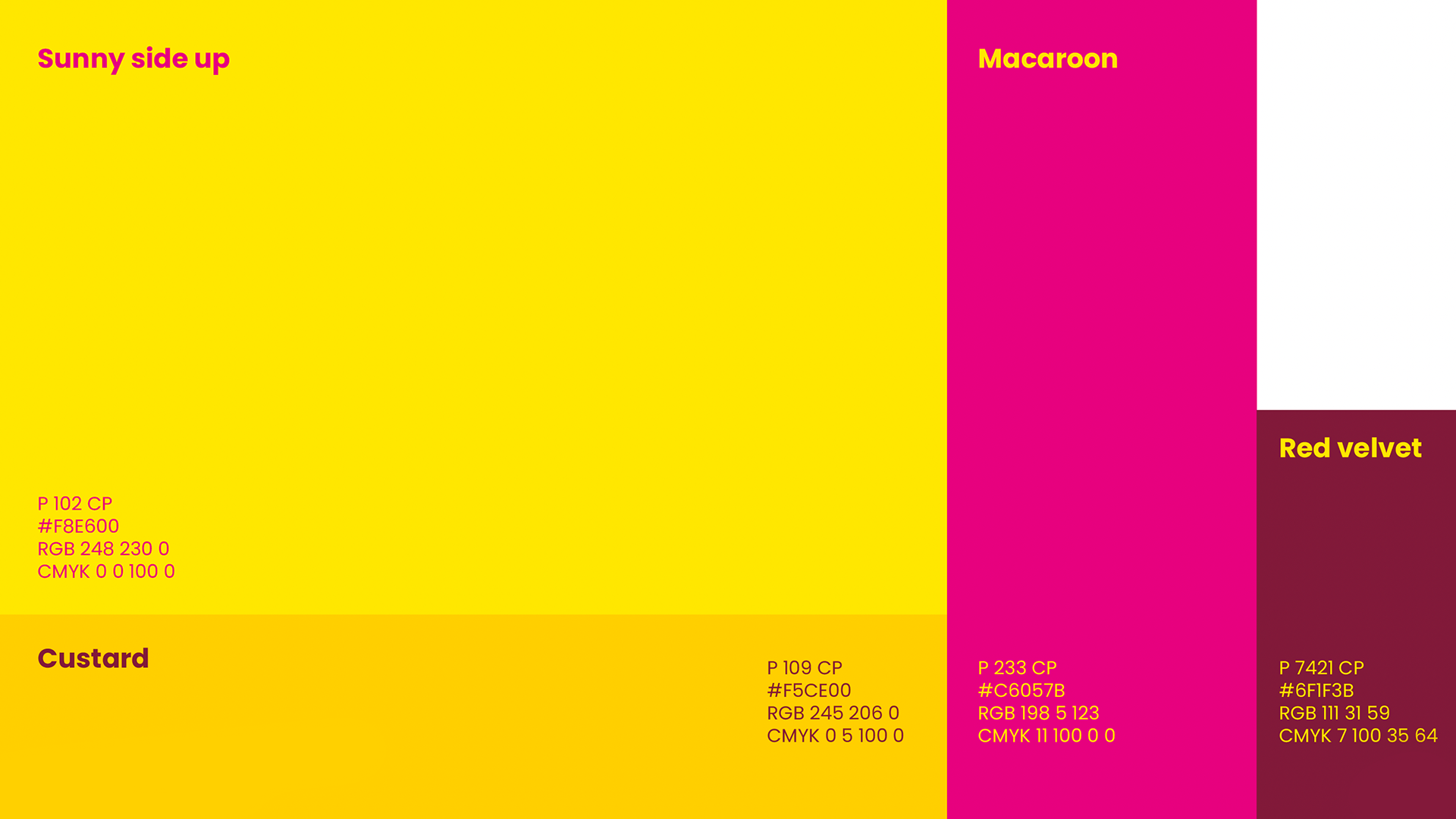
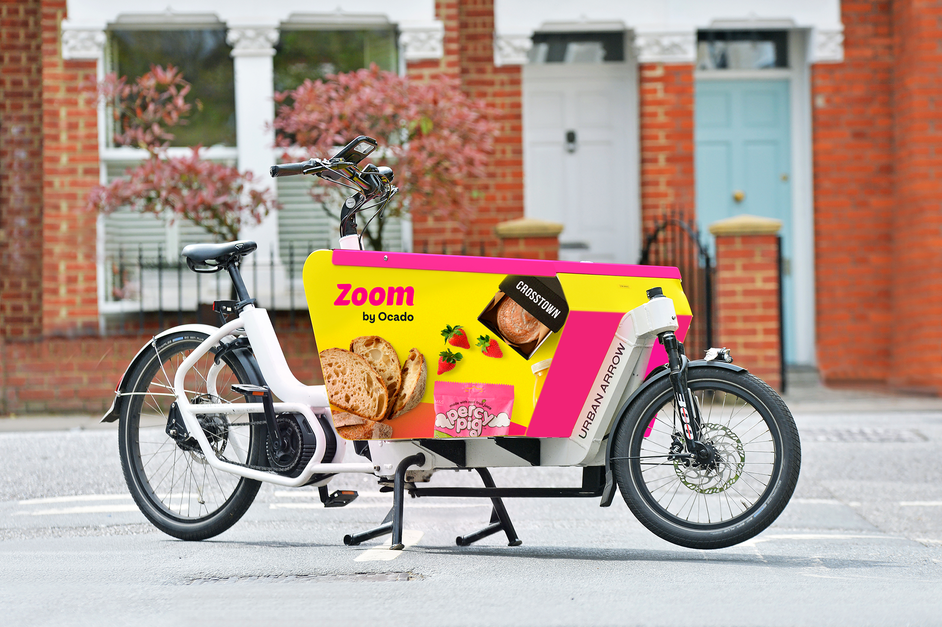
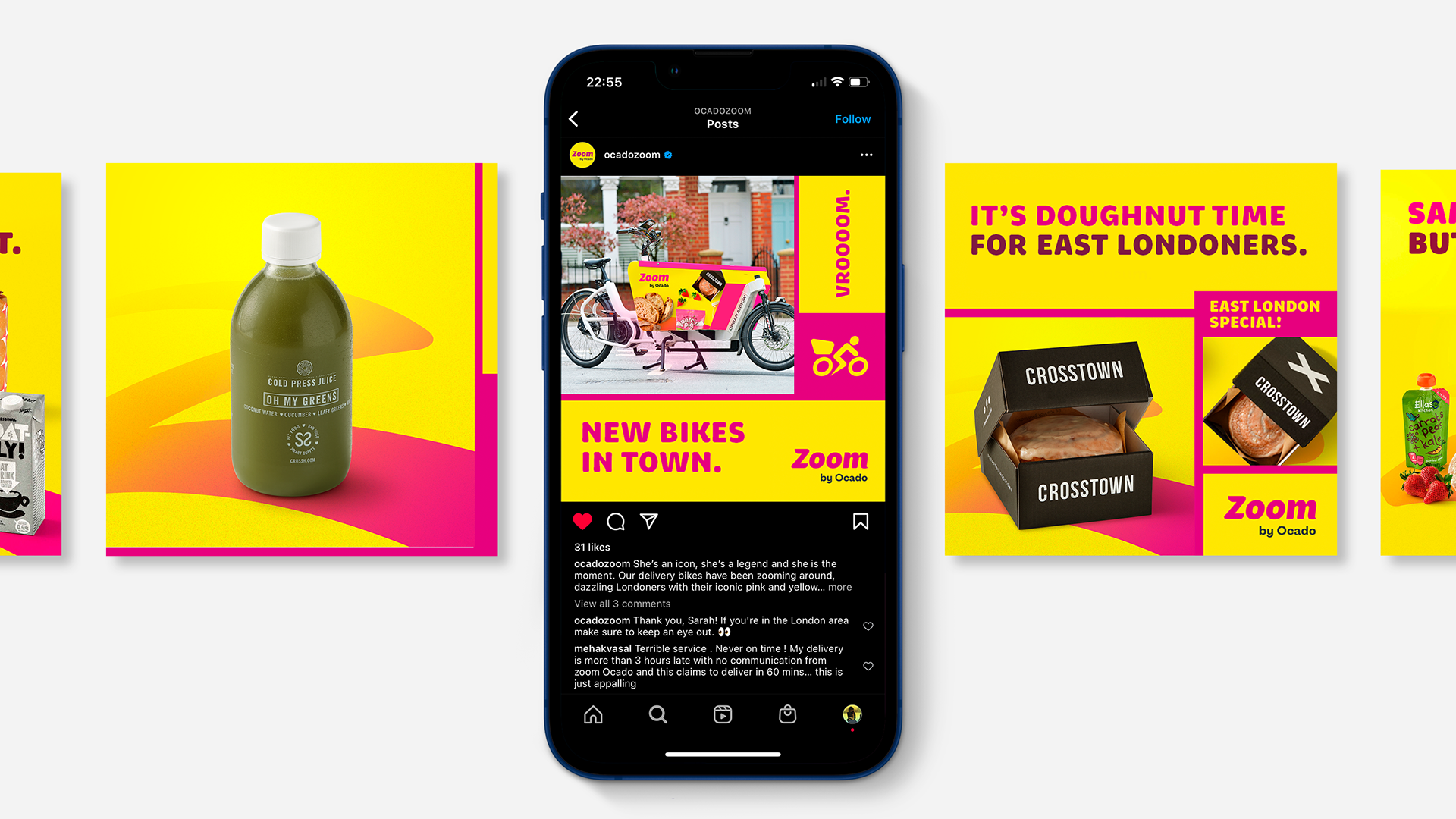
As design lead, I was tasked with rebranding the identity and image of the brand. This included the update of the brand name from 'Ocado Zoom' to 'Zoom by Ocado'. A more disruptive brand palette was created in the form of bright pink and yellow to replace the previous of green and blue of the previous Ocado brand.
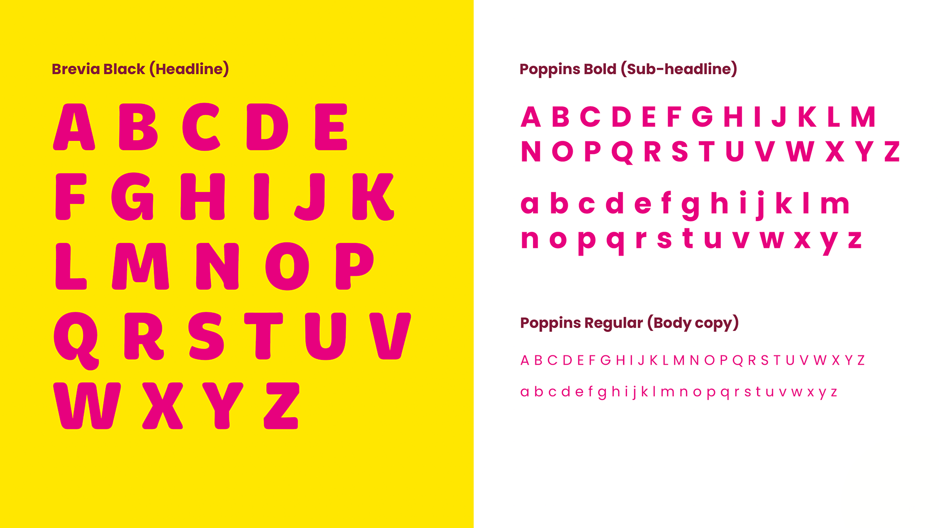
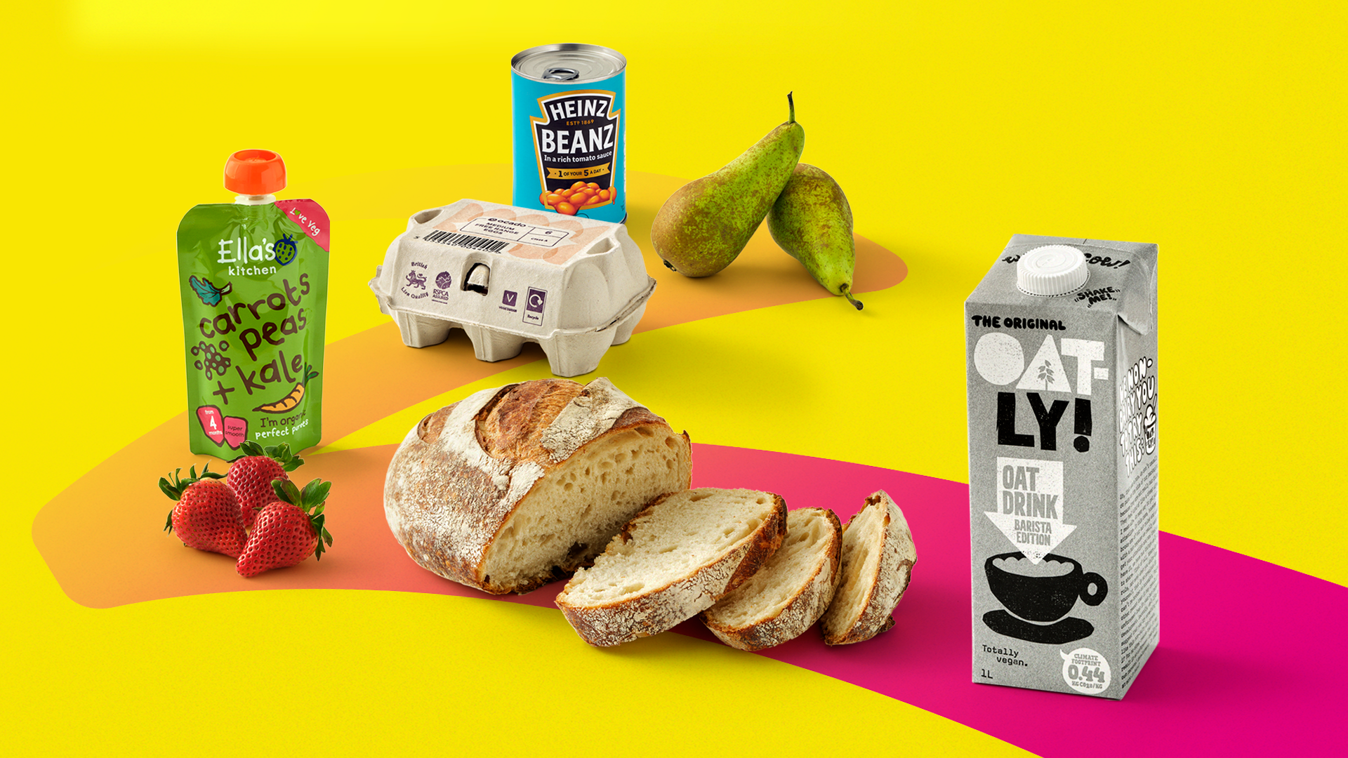
The project included completely new master brand assets from logo, typhography, brand guidelines as well as the and the art direction of the new Zoom's photography style.
The original logo design incorporated a unique Z shape for Zoom’s emblem. It’s shaped like a road symbolising that it can deliver from A to B at speed. Unfortunately, while the logo was in development, the emblem's comparisons with the Russian war symbol at the time meant that the emblem in the logo was removed to ensure no association with the conflict in the Ukraine. Although the Z emblem was removed from the logo, it was kept as an abstract secondary brand asset in the form of the Z-road motif.


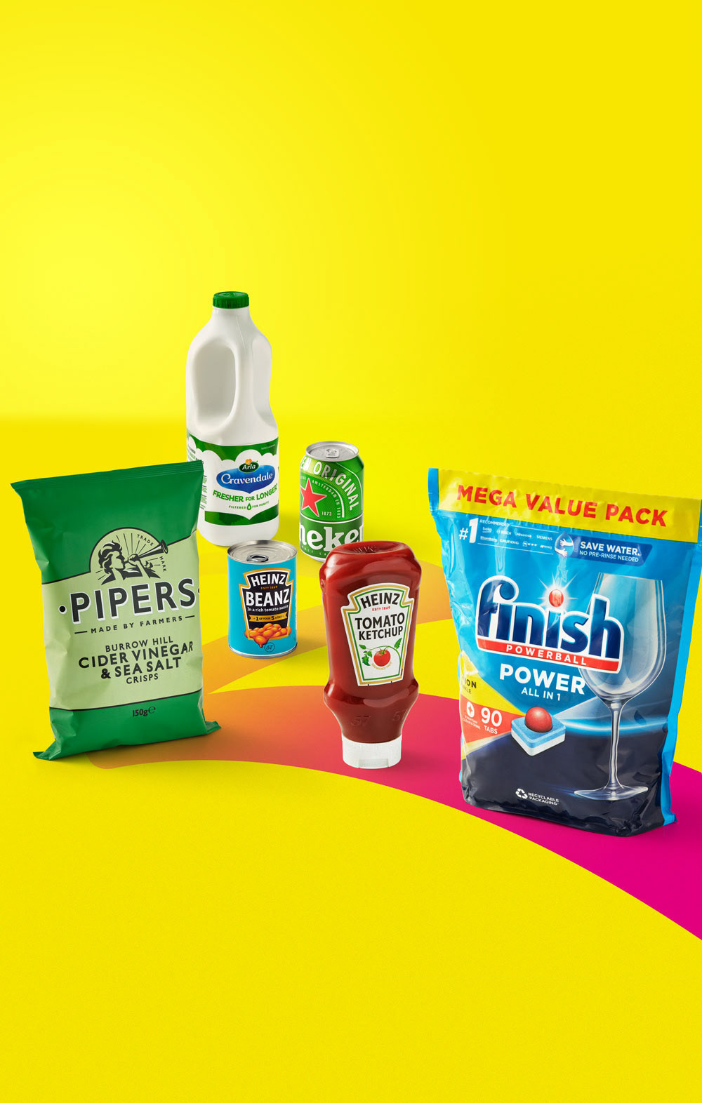
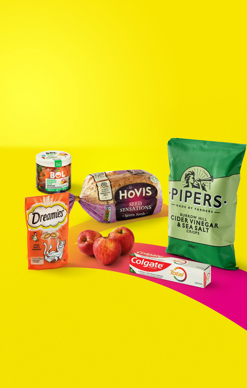
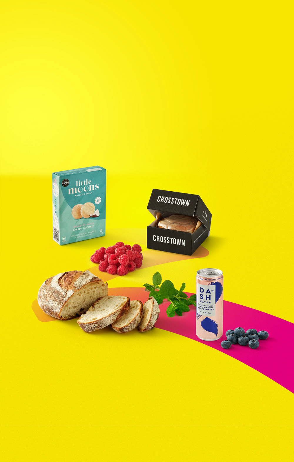
To vividly illustrate the extensive variety and unparalleled pace of Zoom by Ocado, a creative approach was adopted. This involved personifying produce items, such as endearing long-haired sweetcorn and whimsical wiggly grapes, by adorning them with motorcycle helmets. This imaginative concept not only conveyed the vastness of Zoom by Ocado's product range but also served as a captivating visual that cut through the clutter, leaving a lasting impression on consumers.