Creative Direction | Graphic Design | Brand Identity | Art Direction
Led the comprehensive rebranding initiative for Ocado Retail, orchestrating the development of master brand assets, logo & identity, house font and brand colours. Resulting in a refreshed and impactful brand identity that stands out from the competitors in this market sector. A new brand strap-line along with a sonic device and bespoke font were developed to align with the overarching brand campaign which launched across national TV & radio.
Within just 12 months of its launch, Ocado experienced a remarkable surge in brand value, witnessing a staggering 72% increase according to Kantar's report in September 2021. This significant growth propelled Ocado to claim the title of the fastest-growing brand in the UK.
Furthermore, the impact of the rebrand & campaign extended beyond financial metrics, as active customer numbers surged by an impressive 40% within the initial three years. These statistics underscore the success of Ocado's strategic initiatives and the resonance of its brand among consumers.


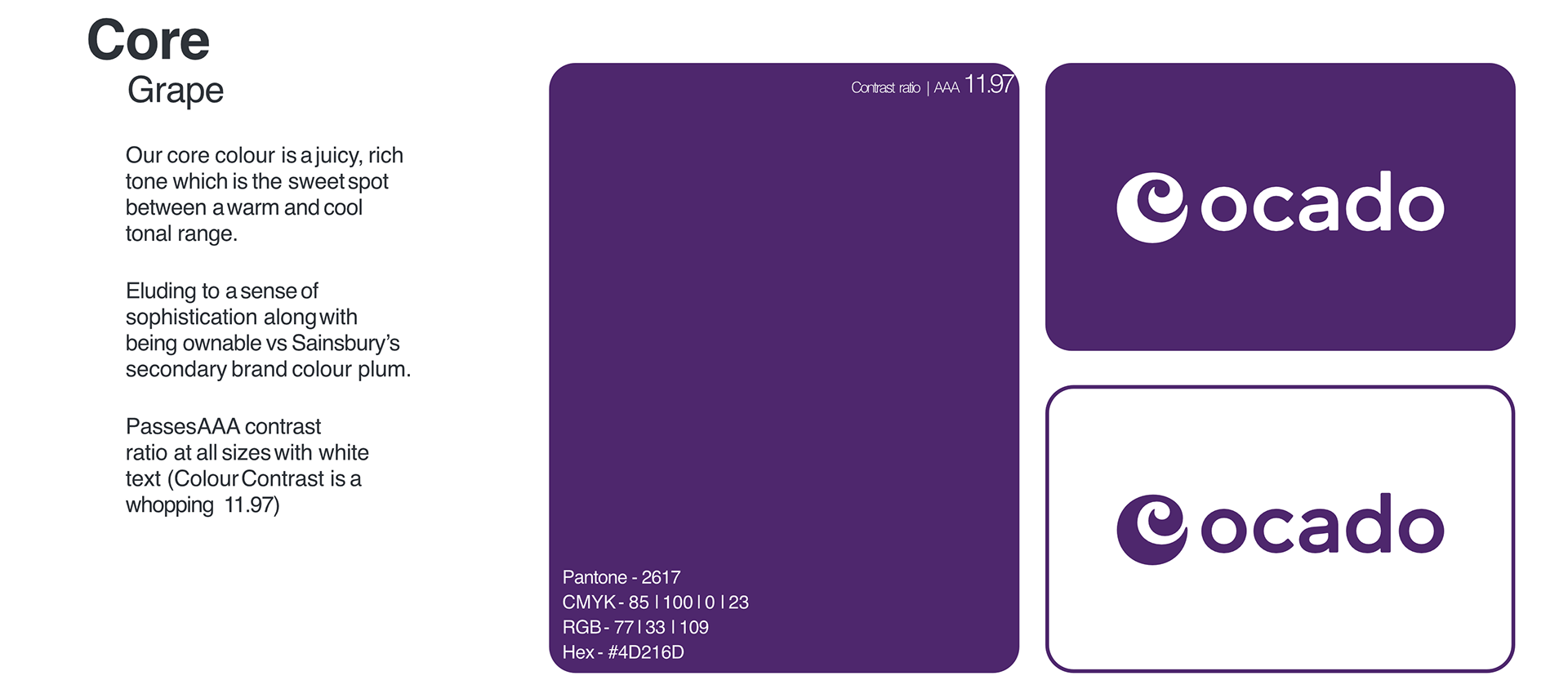
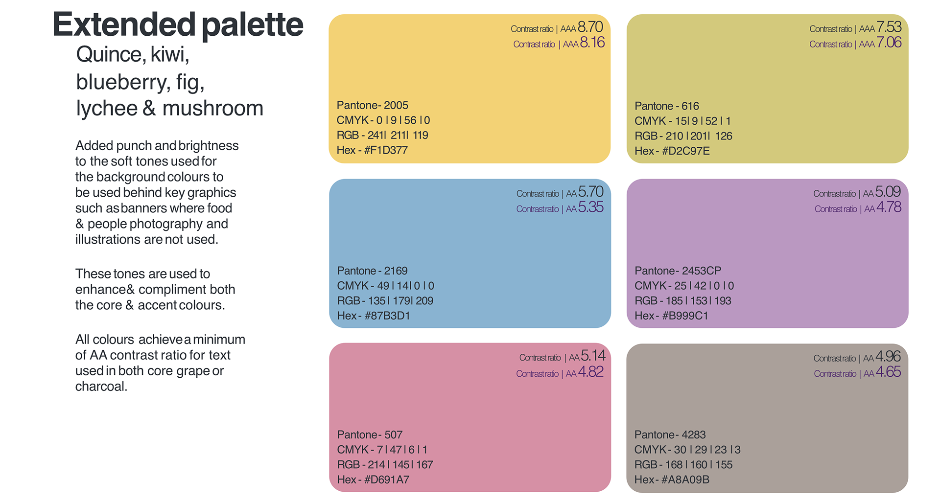
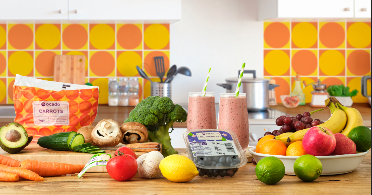
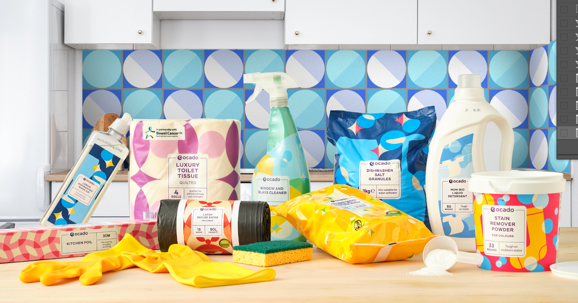
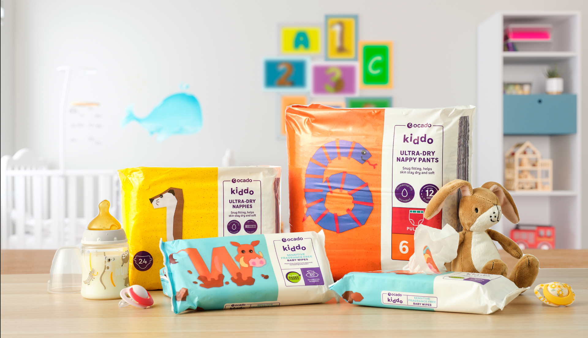
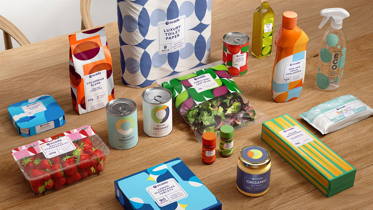
A unique and distinctly 'Ocado' colour palette was developed to ensure standout but to also differentiate the recent shift from Waitrose and the predominantly green branding used for the previous number of years. It was essential that the new palette set consistently high AA accessibility standards across all platforms for a brand that is digital first.


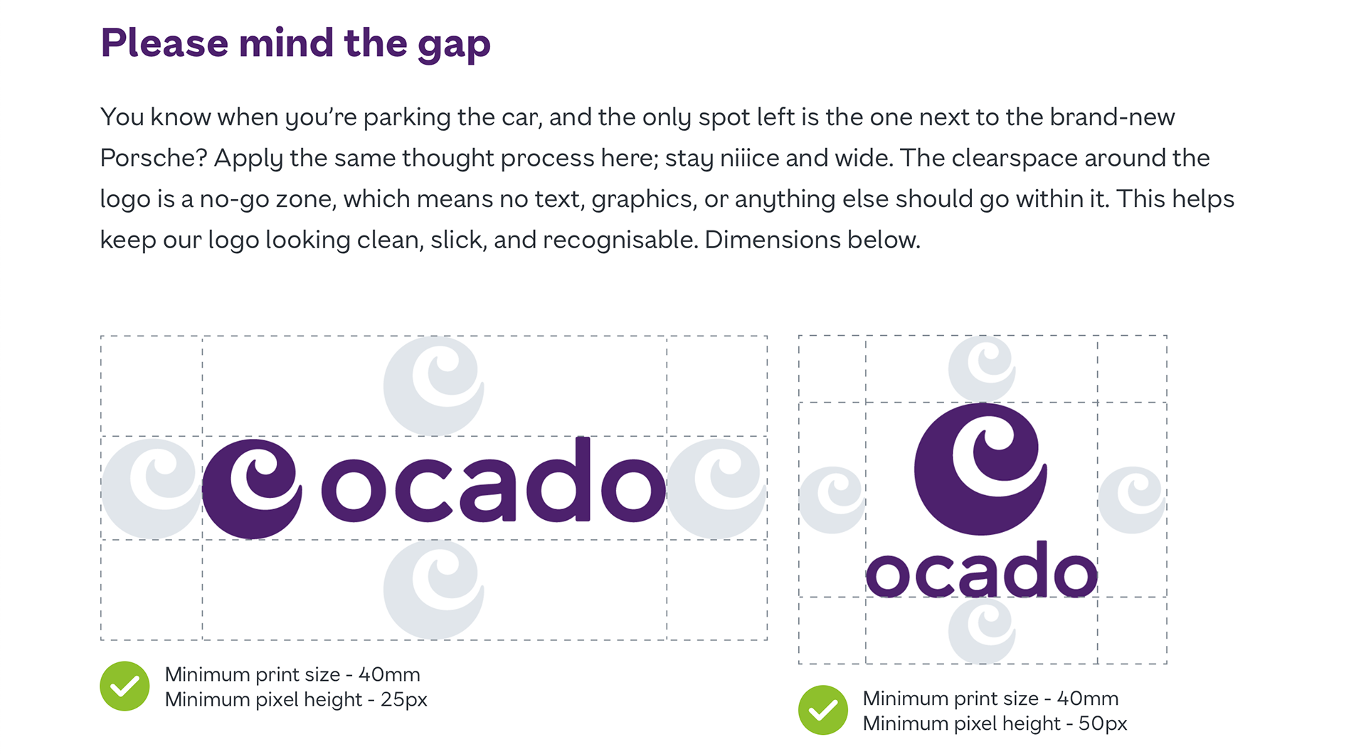
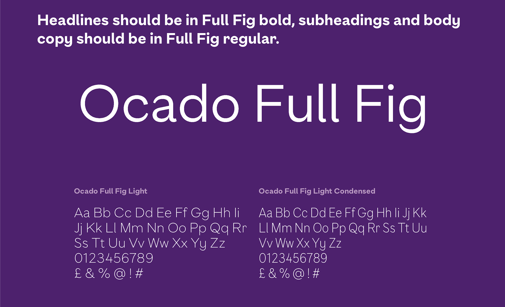
An impactful but still playful font to replace the 'off the shelf' font of the previous branding was originated to echo the upbeat tone of voice.

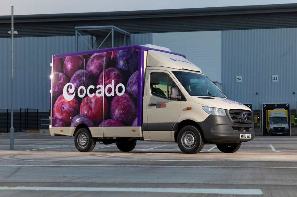
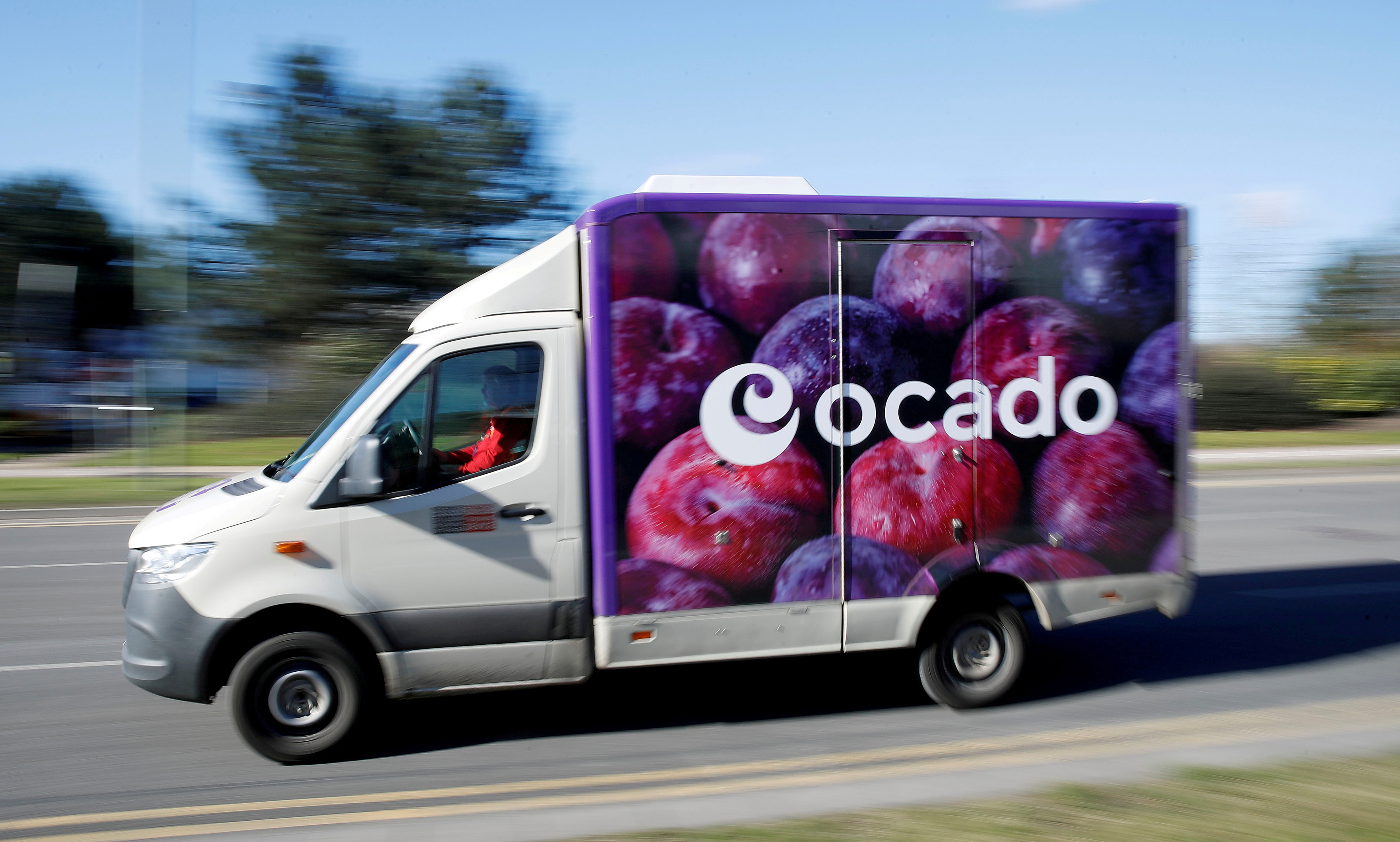
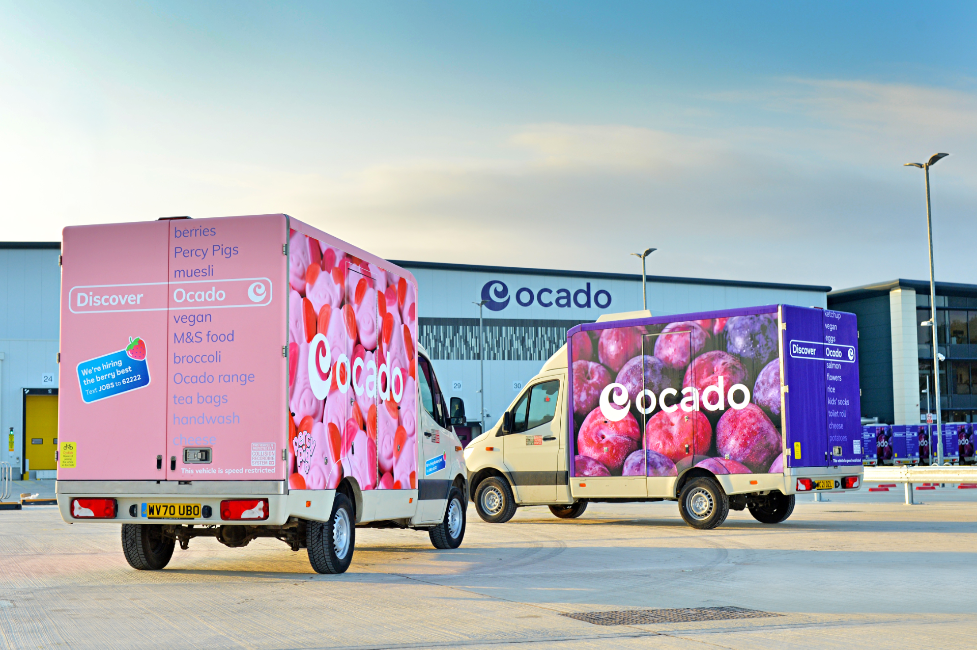
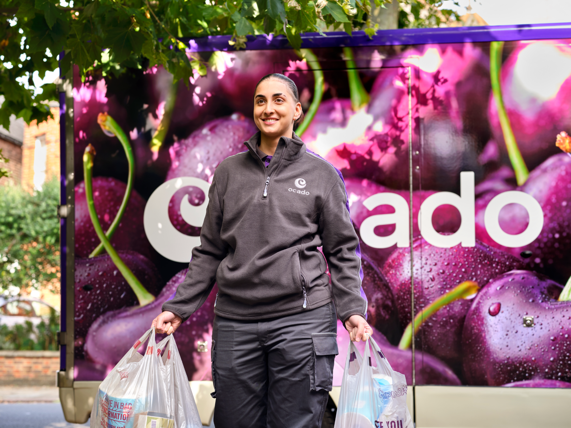
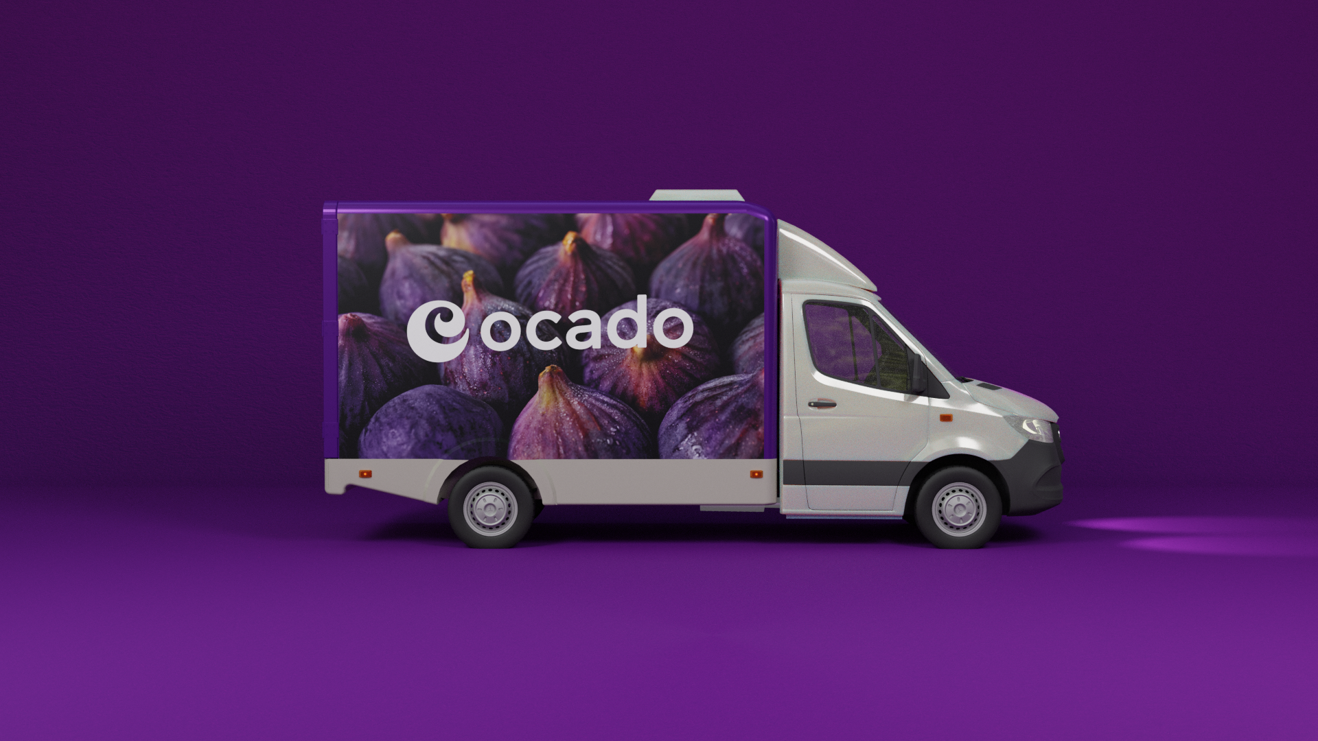
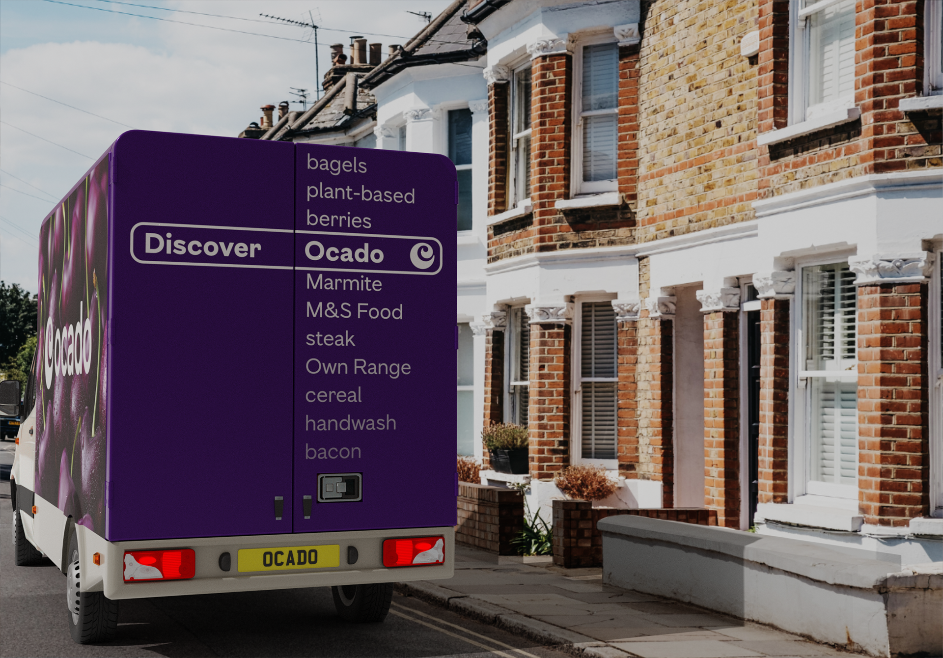
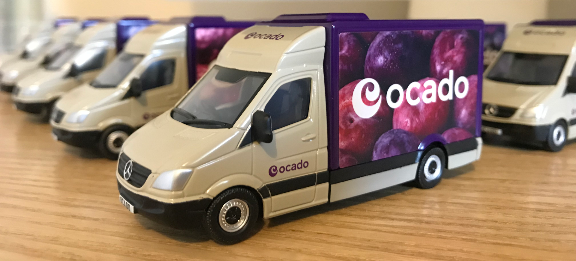
The entire Ocado delivery fleet was rebranded into the core brand colour 'Grape' along with new close up photography of fresh, mouthwatering 'purple' fruit & veg to carry the colour platte across the fleet in a seamless way. To coincide with the joint venture with M&S Food, special edition a Percy Pig livery was created for a select number of the vans.

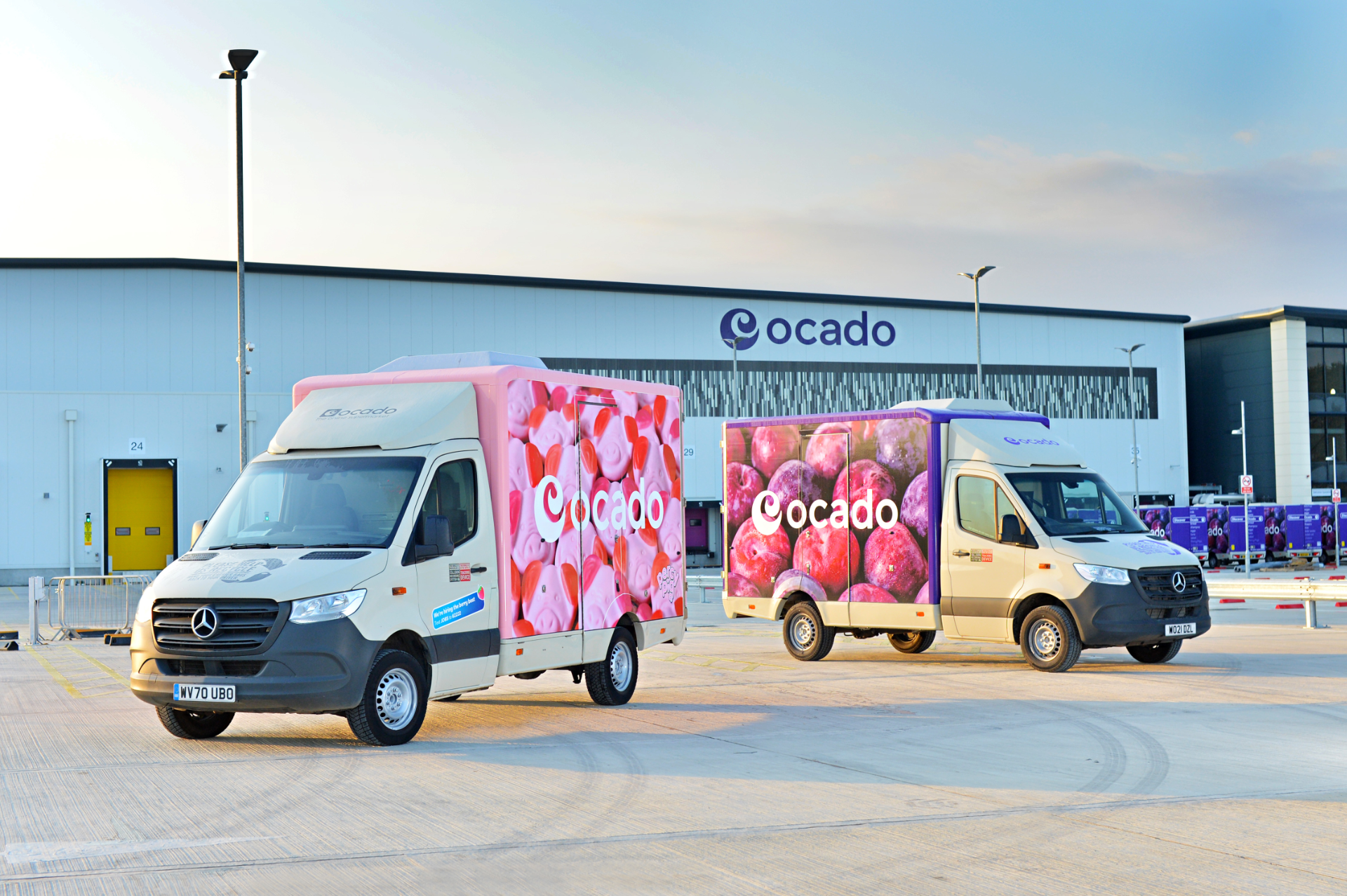
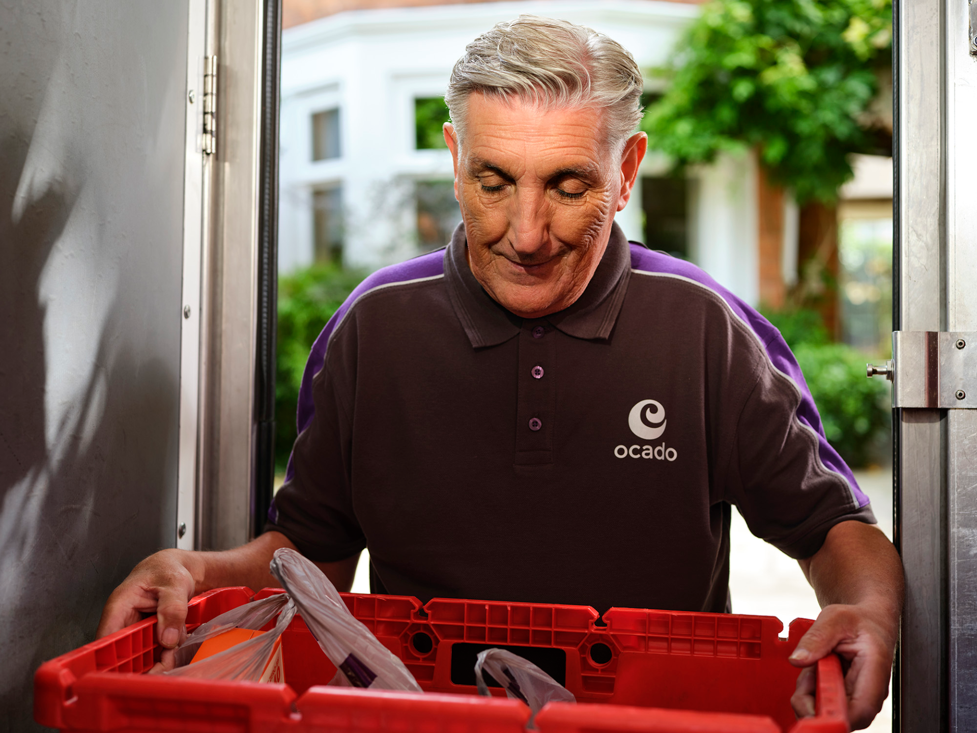
In keeping with the changes to the van livery, new driver uniforms were developed with a strong brand identity, as the customers first point of contact with the brand, but also to ensure that the latest in safety clothing and innovations were adopted for the drivers wellbeing.


A 3D van was later modelled for various digital platforms as well as television commercials.

Brand launch across national television of the new branding, sonic and strap-line. The line was created using a handwritten style which makes the strap-line feel personal, like it’s been written by a friend, helping customers feel connected to the brand.

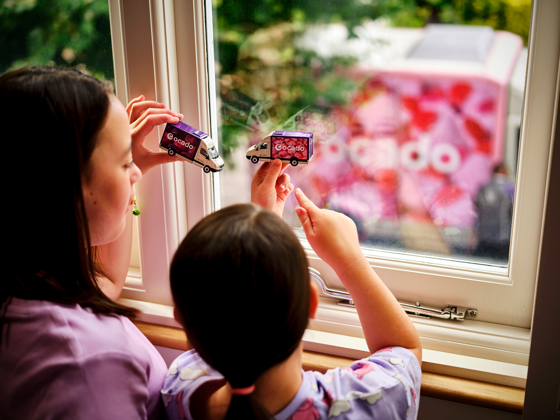
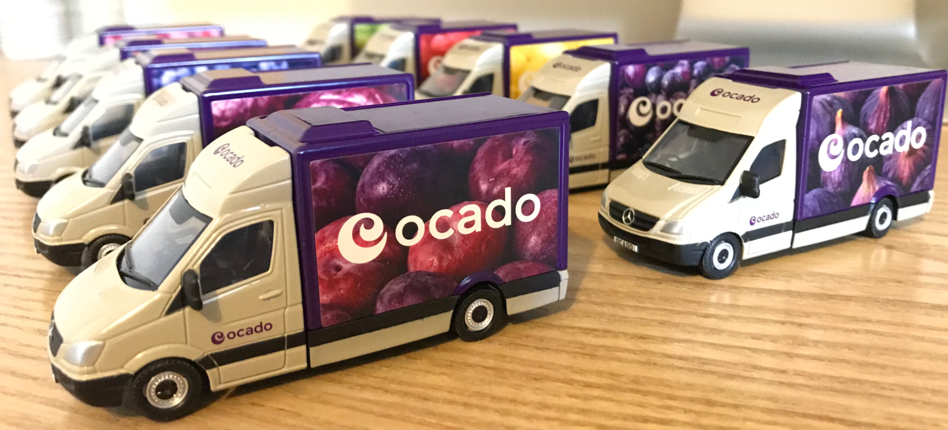
Limited edition die-cast toy vans were made as that 'little something extra' and have been an incredible hit with children of all ages.
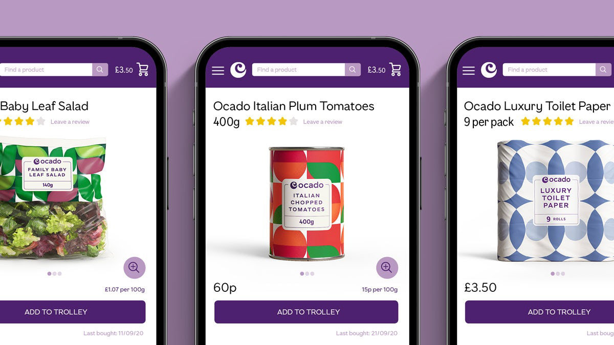
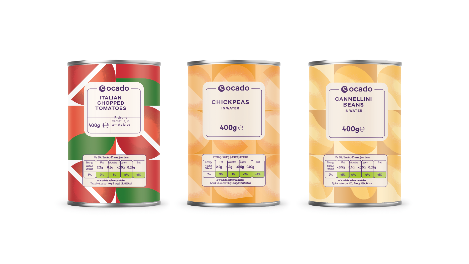
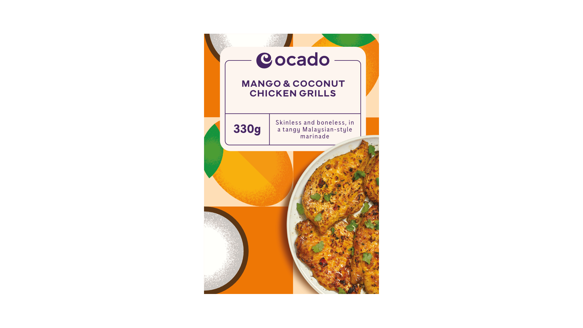
A full rebrand of the Ocado Own Range label was also developed in keeping with the new brand direction and to capture the image of quality at great value.

As the brand grew and evolved since launch, new creative directions were followed but are always underpinned by the 'There's an Ocado just for you' brand message and with new design systems seen integrated across all channels.